The Tile Files: Mastering Tile Layouts for Your Home Renovation
Have you ever wondered how interior designers bring those beautiful tile layouts to life? If so, this post is for you!
I woke up today feeling excited about a project we are diving into this week. The family we are working with wants to bring a lot of personality into their 100-year-old home with creative expressions of art, bright pops of color, and lots of texture. The end result will be a joy-filled home that reflects their personalities and brings smiles around every corner.
Currently, we’re focusing on their guest bathroom. The goal is to create a playful display with tile patterns and bold wallpaper. This project got me thinking about the challenges that homeowners face around tile selection. The world of tile can feel overwhelming, with so many types, shapes, sizes, and colors to choose from.
Finding the perfect tile for your project can take time and determination. Once you find the tile and feel confident that it coordinates with all of your other room choices, you have another challenge to tackle: mastering the tile layout!
I am going to take you on my journey of experimenting with tile patterns to find the perfect layout for my client's project. I will show you a wide variety of patterns and demonstrate how the same tile can create a totally different vibe in your room, depending on how you lay it out.
Use color as a compass
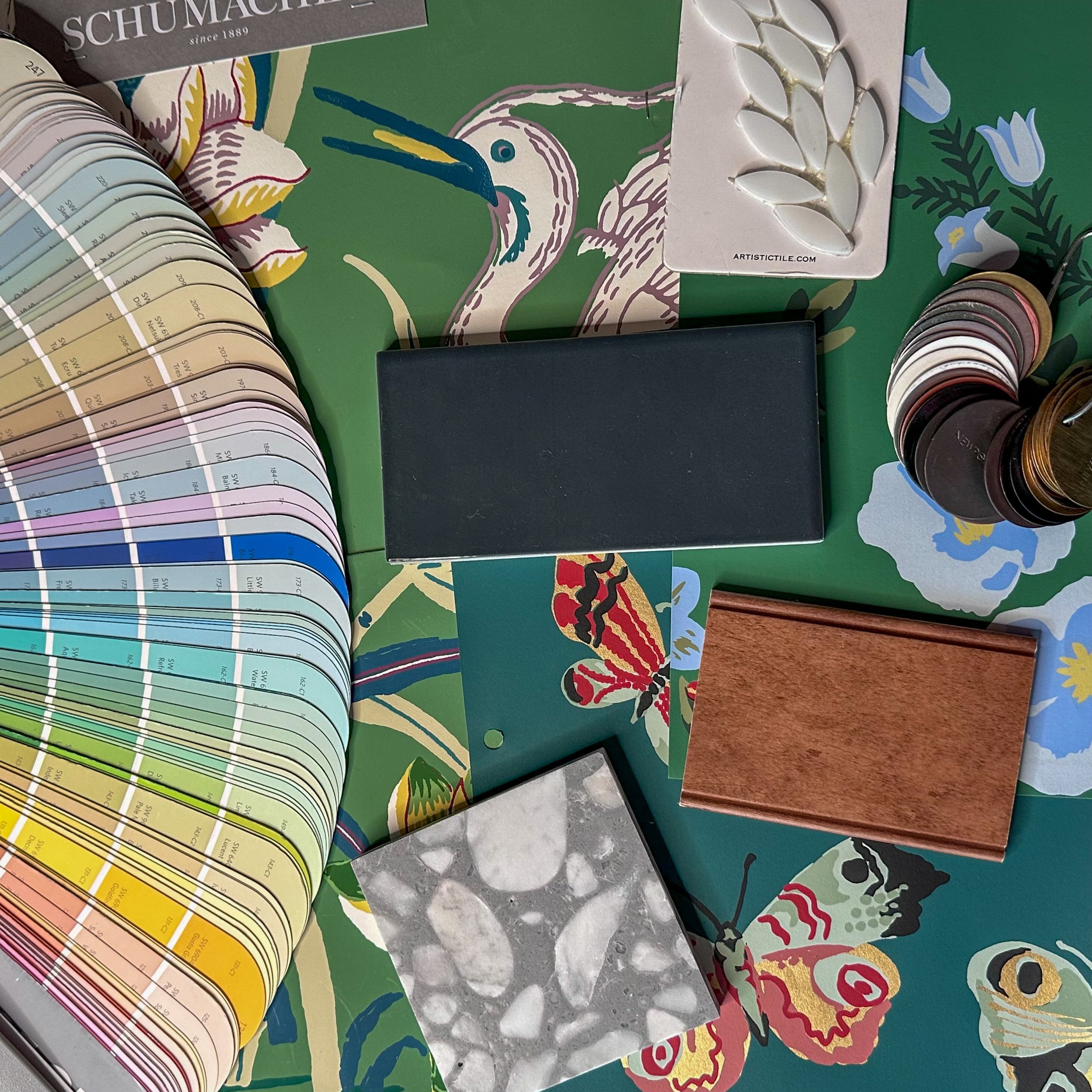
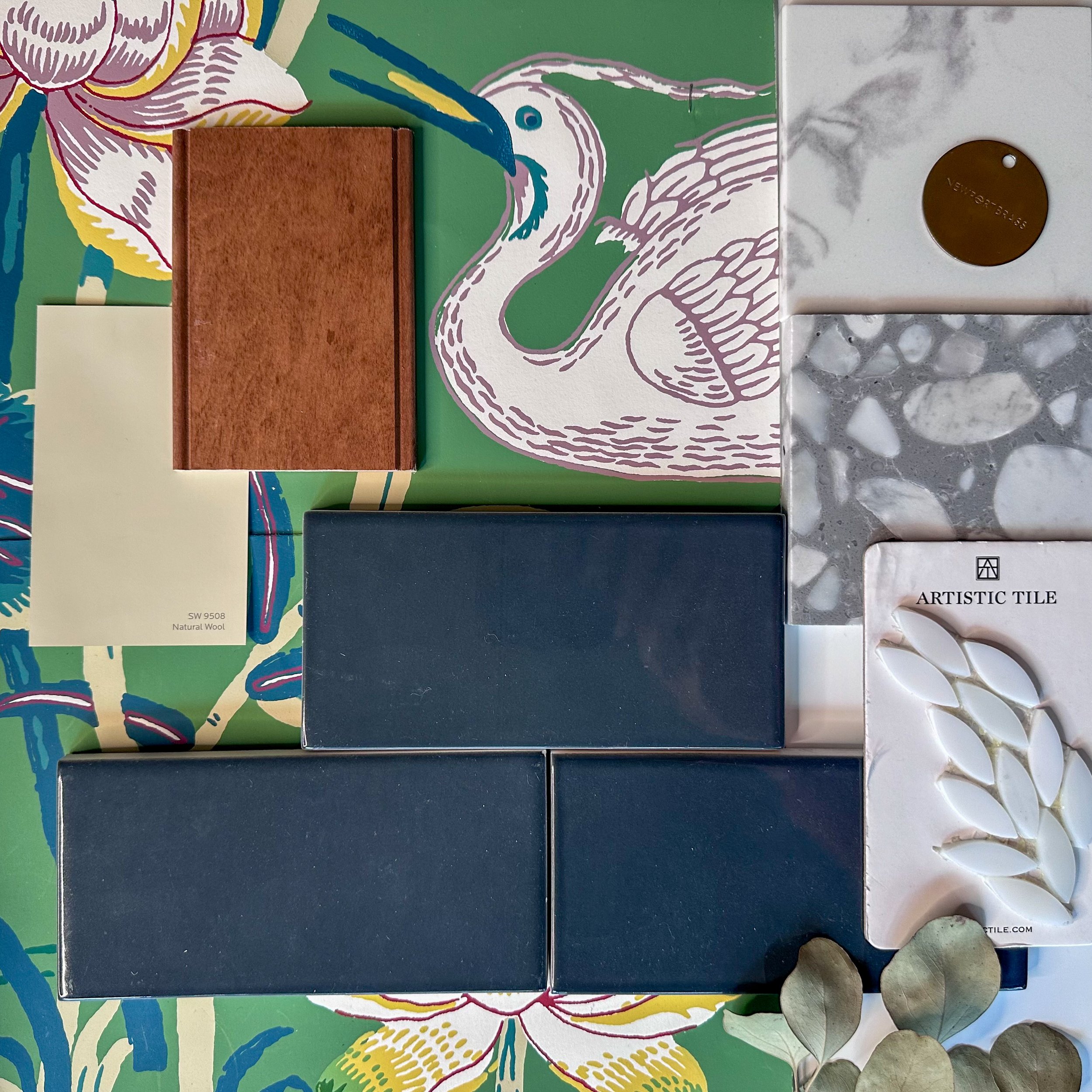
Our design process begins by establishing color direction. In this case, the wallpaper will be the star. I will identify the perfect paper and then coordinate the tile choices to match.
Deep dive into the details
With the color palette all set, I look at fine-tuning the tile details. In this case, we are pairing a gorgeous pale gray terrazzo tile from Ann Sacks with a rich deep sea color shower wall tile by Walker Zanger. The shower is curbless—so we will run the terrazzo tile in both the main section of the bathroom and the shower for a clean, seamless installation.
Complement your wallpaper
We want the shower walls to be interesting without competing with the bold pattern of the wallpaper. Since we are using a single tile color, the best way to introduce visual interest is in the size and pattern.
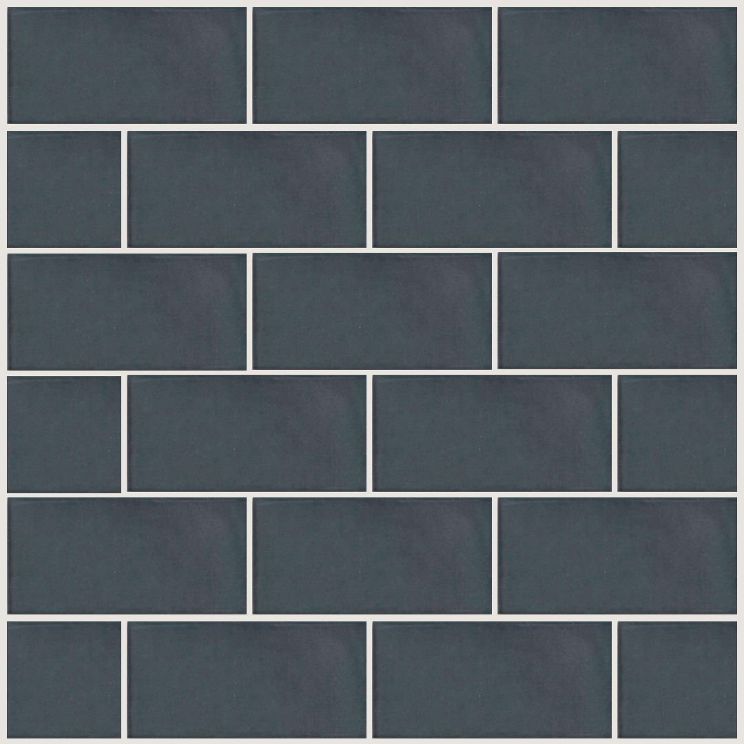
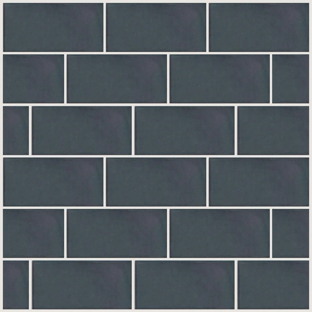
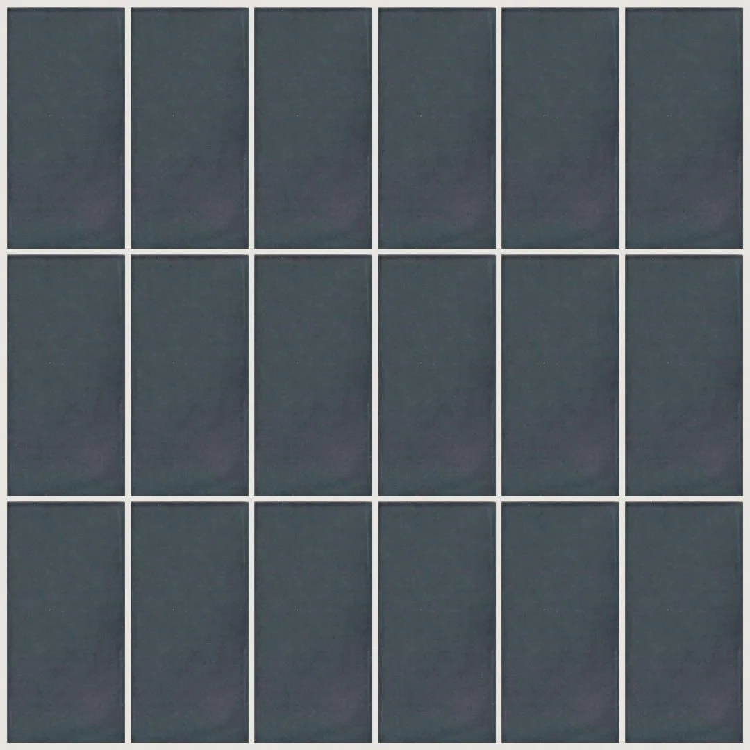
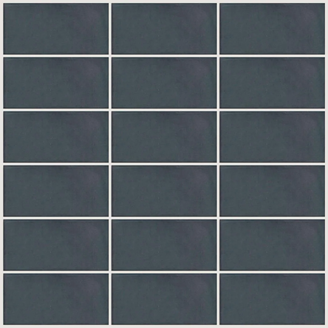
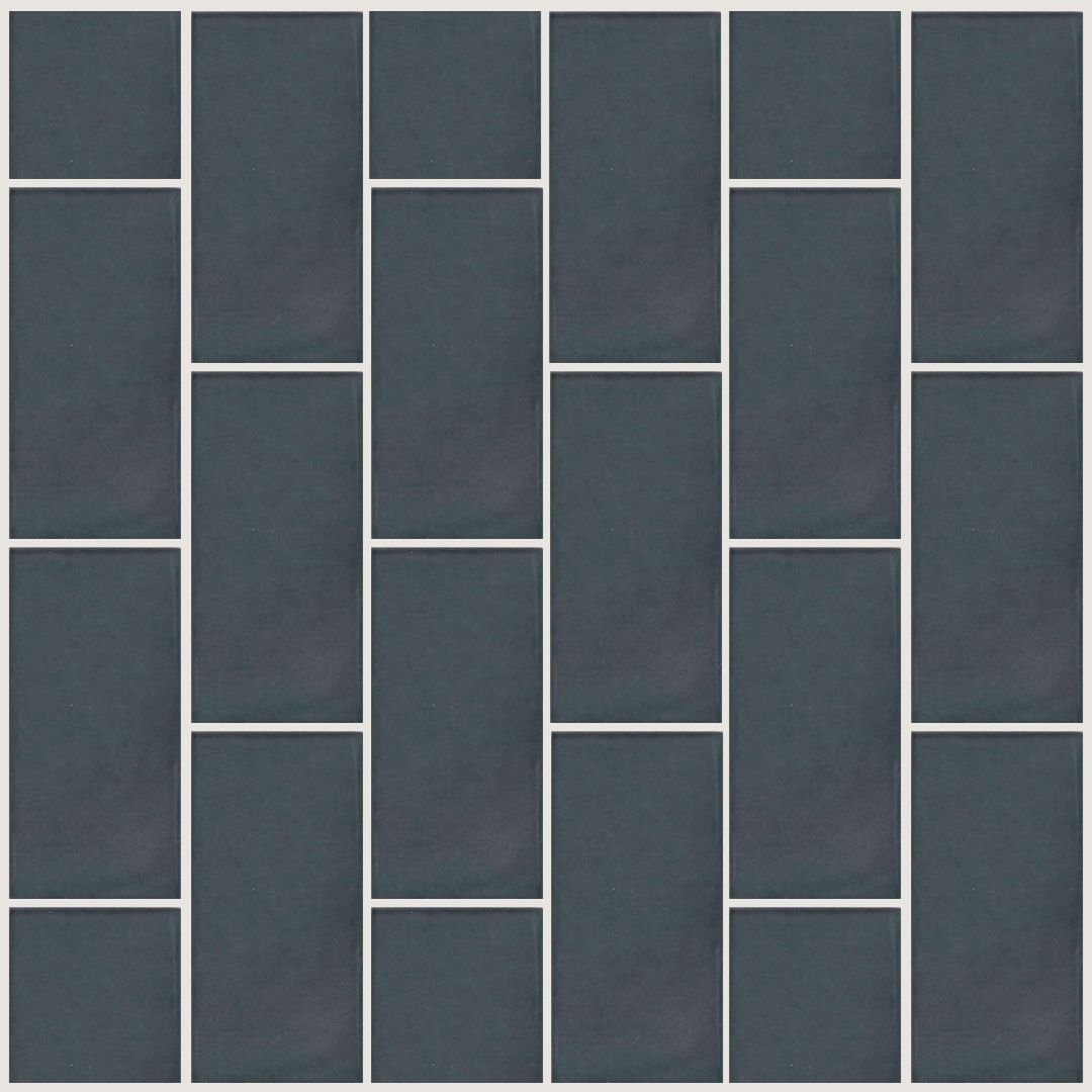
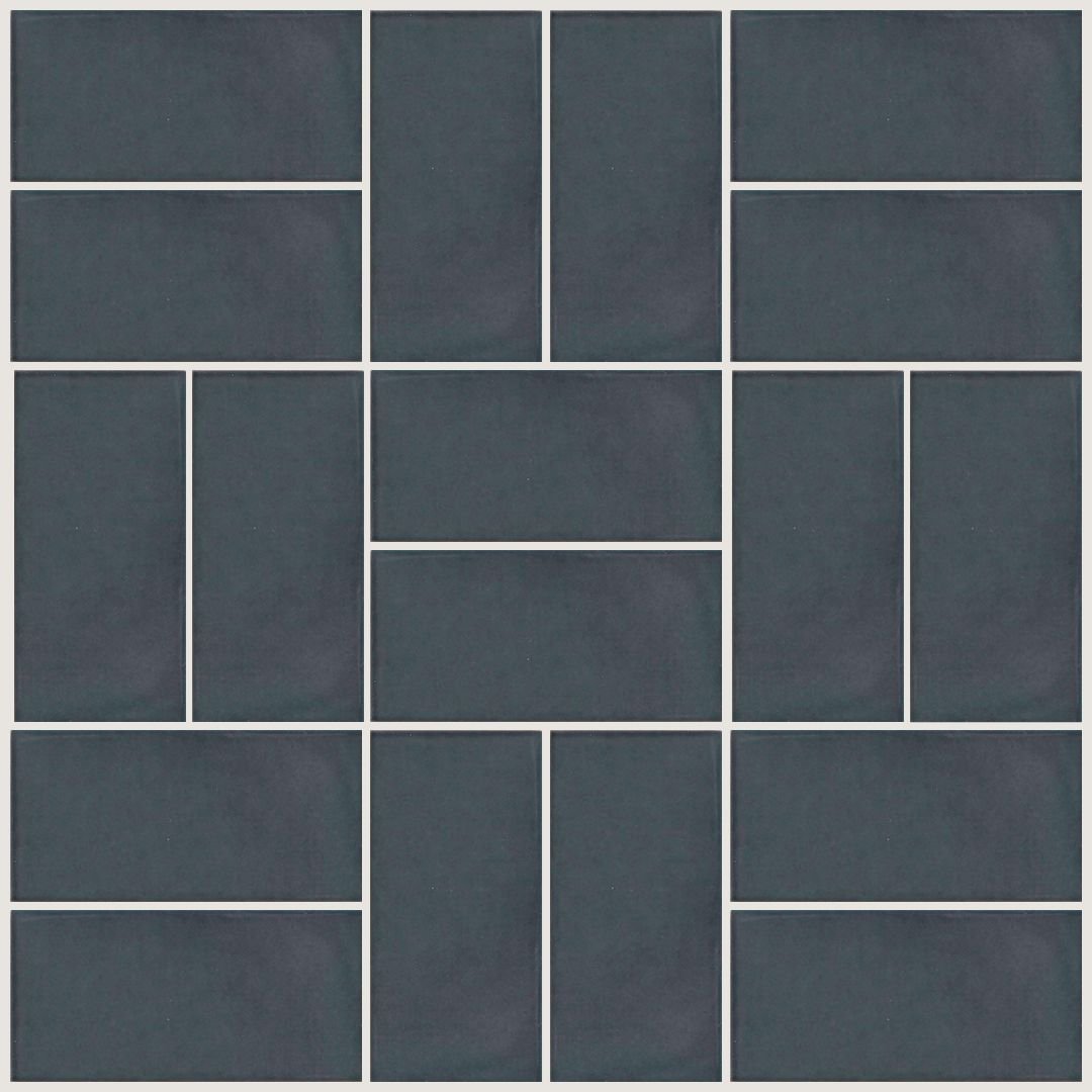
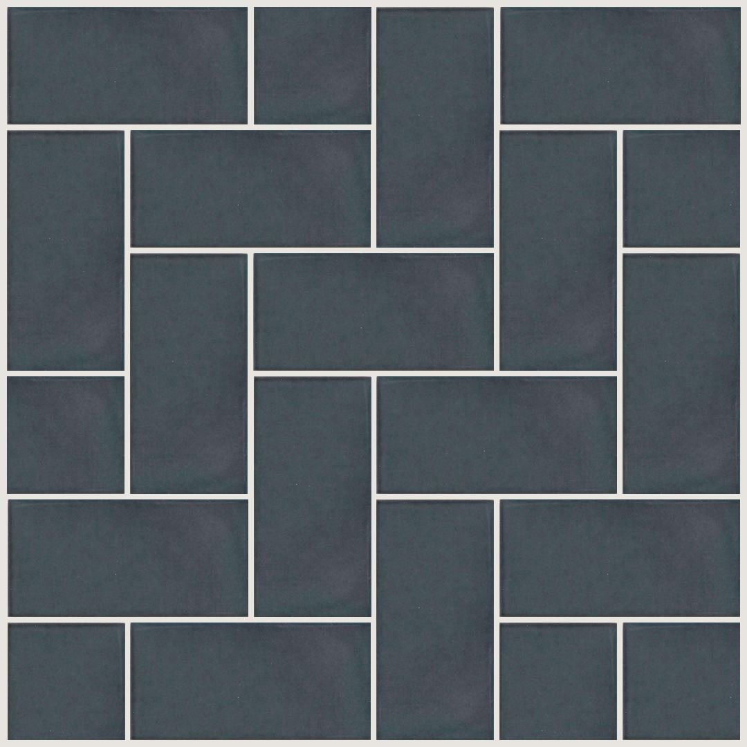
This is where the fun begins! This particular wall tile comes in a variety of finishes and sizes. The glossy version is the best choice paired with our wallpaper to add depth and shine to the shower. We opted for a classic 3 x 6 subway shape. Next we generate digital pattern layouts to help our client visualize the pattern opportunities.
RUNNING BOND
1/3 OFFSET
STACKED VERTICAL
STACKED HORIZONTAL
VERTICAL RUNNING BOND
BASKETWEAVE
HERRINGBONE
STEP LADDER
Curious about what pattern our client chose?
Ta-da! A bold Schumacher wallpaper paired with a traditional running bond shower wall tile pattern is the winner! We are loving this combo and can’t wait to get it installed!
Let your tile style shine!
Do you feel like you’re ready to master the art of tile layout? Wipe the sweat off your brow—I’m just kidding! It definitely takes research, prep work, and experimentation to find the look that works best for your space.
In the meantime, you can continue your tile journey with Renovation Blueprint. Check out our interview with a TileBar expert to learn more about the process of sourcing tile for your home.
I recommend following that post up with this great guide to no-sweat sourcing for your renovation!
Are you enjoying your renovation journey? Every Friday, I share new tips and tricks to help bring more ease and joy into your renovation process. Sign up for my weekly newsletter so that you never miss an exciting update!
